Remember when kitchens weren’t afraid of color? From candy-pink appliances to avocado-green cabinets, the 20th century gave us some unforgettable kitchen shades that are finding new fans today.
For decades, homeowners experimented with bold colors, cheerful pastels, and earthy tones. The 1950s brought playful pinks and turquoise, while the 1960s and 1970s embraced avocado green, harvest gold, and warm orange. These colors did more than decorate a room; they gave kitchens personality. Today, vintage-inspired interiors are bringing many of those shades back, often with modern finishes and more restrained combinations.
Avocado Green
This unmistakable shade once covered everything from refrigerators to kitchen cabinets, and its earthy charm is making a comeback in modern homes.
Avocado green became especially popular in the late 1960s and 1970s, when homeowners embraced nature-inspired colors. Paired with dark wood cabinets, patterned wallpaper, and warm countertops, it created cozy, lived-in kitchens.
You don’t need to recreate an entire 1970s kitchen to enjoy the color today. Try avocado-green lower cabinets, a painted island, or a backsplash to introduce the shade without overwhelming the room. Cream walls, natural wood, and brass hardware can soften the look and make it feel intentional, not dated.
Harvest Gold
Warm, sunny, and unmistakably retro, harvest gold made ordinary kitchen appliances feel like part of the decorating scheme.
This golden yellow-orange shade became a signature of 1970s American kitchens. Refrigerators, ovens, and other household appliances appeared in matching finishes, often alongside avocado green, brown, and burnt orange.
Today, harvest gold can warm up a kitchen without a major renovation. Consider it for a statement backsplash, pendant lights, bar stools, or small appliances. For a vintage look, pair it with walnut cabinets and cream-colored walls to balance its richness.
Turquoise Blue
Few colors capture the cheerful optimism of a 1950s kitchen as well as turquoise.
Mid-century kitchens often combined turquoise with white, chrome, and black accents, creating bright interiors that felt fresh and modern. The shade appeared on appliances, accessories, and dining sets, giving everyday spaces a playful personality.
A modern kitchen can borrow that retro spirit through turquoise cabinetry, colorful bar stools, or a tiled backsplash. Pair it with white countertops and simple hardware to keep the room feeling light. Even a turquoise toaster or stand mixer can add a nostalgic touch without a permanent change.
Candy Pink
Pink kitchens once made a bold statement, proving that practical spaces could also be playful and glamorous.
Soft pink and brighter rose shades became popular in American kitchens during the postwar decades, particularly in the 1950s. Pink appliances, pastel cabinets, and coordinated accessories created cheerful rooms that stood apart from the plain white kitchens of earlier years.
The modern approach is to use pink with a little restraint. Dusty pink cabinets, pale rose walls or a pink backsplash can look sophisticated alongside white marble, warm wood or brushed-metal fixtures. For a smaller commitment, try pink kitchen linens, a vase or a colorful countertop appliance.
Related: The Best Colors to Paint a Small Kitchen to Make It Look Bigger in 2026
Burnt Orange
If your kitchen needs warmth and personality, this retro shade brings both in one bold stroke.
Burnt orange became associated with the earthy palettes of the 1970s, appearing alongside brown, avocado green, and harvest gold. Those combinations reflected a shift toward warmer, nature-inspired interiors rather than the brighter pastel schemes of the previous decade.
You can bring the color into a contemporary kitchen through terracotta-inspired tiles, dining chairs, pendant lights, or a painted pantry door. Burnt orange works particularly well with cream, dark wood and muted green. Use it as an accent if you want a lively room without making the entire kitchen feel saturated.
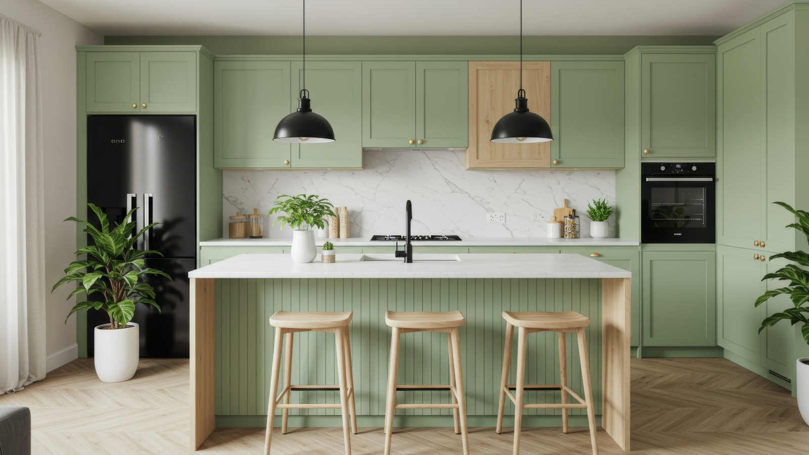
Mint Green
Fresh, gentle, and wonderfully nostalgic, mint green can brighten a kitchen without relying on stark white.
Pastel greens appeared in early 20th-century kitchens and stayed in the colorful appliance and accessory palettes that carried into the postwar years. Their appeal came from their lightness: mint green could brighten a room while complementing white cabinets, chrome fixtures, and patterned floors.
Today, mint green works beautifully on cabinets, wall tiles, or a small breakfast nook. Pair it with warm white and natural wood for a softer vintage look, or add black hardware for a sharper contrast. If you are unsure about painting cabinets, start with a backsplash or a few carefully chosen accessories.
Bringing Vintage Color Into a Modern Kitchen
The secret to making these old-fashioned shades look beautiful today is knowing when to stop.
You don’t need avocado cabinets, harvest-gold appliances, and burnt-orange walls all at once. Choose one main color, add a complementary shade, and use neutral finishes to give the eye somewhere to rest. Modern designers are increasingly revisiting nostalgic colors while adapting them to contemporary materials and layouts.
For more inspiration, explore these mid-century kitchen designs and see how vintage colors worked alongside wood, patterned surfaces, and colorful appliances. You can also find ideas to make everyday spaces more inviting through simple habits to recharge your mind and body, plus surprising superfoods that can brighten everyday meals.
Which vintage kitchen color would you bring back first: avocado green, harvest gold, turquoise, candy pink, burnt orange, or mint green?